

What You See When You Actually Draw the Map
This is the second article in a six-part series on structured decision making, where I work through a real, publicly discussed case — Mallorca’s tourism debate — using my Strategic Clarity framework: Frame, Map, Imagine, Design, Decide, Commit. This piece covers Map, done as dynamic systems mapping rather than a static list. Methodology notes and context at the end.
In the first article of this series, I named a goal corridor for Mallorca’s tourism debate — five distinct goals, including (a) reducing the island’s total burden on water and ecosystems, and (b) reducing the seasonal concentration of visitors, explicitly without endangering (a). I flagged that whether „spread tourism evenly“ — a strategy aimed at (b) — actually serves or undermines (a) wasn’t something Frame could answer. That question needed system connections traced, not goals named. I didn’t have that map yet.
Now I do. Over the past weeks, I ran Mallorca’s tourism debate through a structured mapping exercise, using my own Strategic Clarity software as an internal test case. Not a survey. Not a forecast. A deliberate attempt to draw out what actually connects to what — instead of treating „too many tourists“ as one isolated problem with one isolated fix.
What came out of it is more tangled, and more informative, than I expected.
One clarification before going further: everything below describes mechanisms — how forces in the system actually connect to each other — not verdicts on any particular strategy. Whether „spread tourism evenly“ or any other candidate response is a good idea isn’t something Map decides. That comes later, once Imagine has tested it against multiple possible futures and surfaced real building blocks for a response, Design has combined those blocks into genuinely different, holistic strategies, and Decide has weighed them against the selected futures and goals. What Map owes the rest of the process is simply this: an honest account of what’s connected to what, so that whatever gets proposed later has to reckon with mechanisms that are already there, whether anyone chose them or not.
Why dynamic systems mapping changes what you see
Most mapping exercises stop at a static snapshot: a list of stakeholders, a list of drivers, maybe a 2×2 grid sorting them by size or urgency. That’s a list with better formatting. Dynamic systems mapping asks a different question — not just what’s involved, but how the pieces pull on each other once something moves. That’s the difference between the fifteen forces below being a glossary and them being a system.
Fifteen threads, not one problem
The mapping identified fifteen distinct forces shaping the island’s tourism dynamics — visitor numbers, water use, housing conversion, seasonal employment, regulatory pressure, investment flows, infrastructure capacity, and more — and, more importantly, twenty-seven distinct connections between them. Not a list. A web.
Four self-reinforcing patterns stood out. One explains why „more tourism“ tends to attract more of itself: higher visitor numbers draw investment, investment improves the island’s appeal, appeal draws more visitors — a loop that keeps expanding unless something outside it intervenes. A second shows how rising visitor numbers push housing into short-term rental, which drives up local rents, which builds political pressure, which eventually forces regulation — a real check on growth, but a slow, reactive one that only kicks in once the damage is already visible to enough people. A third connects the timing of visitor flow to the island’s ecological recovery windows — quieter than the first two, but the one this series turns on. A fourth ties precarious seasonal employment to the island’s dependence on tourism volume itself — a loop I’d guess a lot of people in the industry will recognize immediately.
The water paradox, precisely stated
Here is the mechanism the mapping actually surfaces, independent of whether anyone acts on it: the timing of visitor flow and the island’s ecological recovery windows are causally linked, and whether that link helps or hurts depends entirely on whether total volume is capped at the same time.
If the island simply shifts visitors from August into November without reducing the total, the additional off-season demand for water lands exactly in the months that currently allow the island’s water table and stressed ecosystems to recover. That’s the mechanism — not a judgment on redistribution as a strategy, just a description of what redistribution runs into if nothing else changes alongside it. Only when a shift in timing is paired with an actual reduction in total volume does the mechanism work in the island’s favor instead of against it.
This turns out to be exactly the tension Frame’s goal (b) already carried its own warning about: reducing seasonal concentration and reducing total burden sound like the same ambition. They are not. A strategy can succeed at (b) while quietly failing (a) — and it’s easy to not notice, because (b) is the one that shows up in glossy press releases about „off-season campaigns.“
I want to be precise about what this is and isn’t: it’s a structured, transparently-flagged plausibility mapping — not a peer-reviewed hydrological study of Mallorca. Several of the underlying assumptions are explicitly marked as unverified and flagged for further research before anyone should treat them as settled. But the structure of the finding — redistribution without a cap can actively work against goal (a), the very goal it’s meant to serve — is, I think, worth taking seriously regardless of the exact numbers. This is what Frame’s open question actually looked like once mapped: not resolved, but at least now visible enough to test further.
The loop that traps seasonal workers
In the first article, I admitted a gap I’d missed: seasonal workers often need to earn enough in the summer to cover their bills for the rest of the year, which quietly pushes toward exactly the kind of peak-season overload the whole debate wants to reduce. The mapping shows this isn’t a side issue — it’s wired into a loop of its own.
Precarious, heavily seasonal employment increases the island economy’s structural dependence on tourism volume. That dependence generates political resistance to any regulation that would cap that volume. That resistance keeps the volume the same or growing. Which keeps the employment precarious and seasonal. The loop closes on itself.
This also explains, at the mechanism level, why Frame’s goal corridor paired (d) — growing non-tourism economic output — with (e) — putting a regulatory framework in place — rather than listing them as independent items. It’s not that I’m recommending this combination as the right strategy; Map doesn’t get to make that call. It’s that the mechanism itself shows why regulation alone would run into structural resistance: without something loosening the island’s dependence on tourism volume, any attempt at (e) meets exactly the resistance this loop generates. Seasonal workers didn’t create this dynamic. They’re the ones most exposed to it, working the most in the months they’re paid the most, precisely because the alternative — a steadier, less seasonal income — depends on a diversification that hasn’t happened yet.
Who’s actually at the table
The mapping also surfaced something less technical and more uncomfortable: a mismatch between who cares most about an outcome and who has a seat at the table.
In the model I tested, four groups hold formal influence over the island’s tourism strategy: the island administration, the tourism industry, the short-term rental sector, and organized citizen groups. The natural environment — water tables, coastal ecosystems, the seagrass meadows that keep the island’s water clear — has no seat of its own. Its interests are only ever represented secondhand, by whichever of the four parties happens to bring them up. Given that goal (a) — reducing the absolute burden on natural resources — depends entirely on this interest being taken seriously, that’s a structural gap worth naming out loud, not a detail.
The forces nobody on the island controls
One more layer matters here, and it’s easy to forget in a purely local debate: some of the strongest pressures on Mallorca’s tourism system come from entirely outside it. Global climate trends are shifting which months and which regions are comfortable to visit. Competing Mediterranean destinations are actively repositioning themselves — sometimes gaining at Mallorca’s expense, sometimes losing to it. EU-level rules on short-term rental regulation set boundaries the island itself can’t move. Any strategy that only looks at what happens inside Mallorca’s own borders is missing a real part of the picture.
Where this goes next
Dynamic systems mapping isn’t the end of the process — it’s what makes the next step honest. Now that the connections and the gaps are visible, the next article moves into Imagine: testing the situation against multiple different futures, and surfacing the raw building blocks — option impulses — a real strategy could eventually be built from. Design then takes those building blocks and combines them into genuinely different, holistic strategies, which get tested against the selected futures and goals in Decide.
A note on this series: This article draws on an internal test run of my own Strategic Clarity software, applied to Mallorca’s tourism debate as a demonstration case — not a commissioned project for any real client. This case is offered as a discussion prompt and a working example, not as a complete or authoritative account: the connections mapped here are a structured starting point, not a finished picture of everything that shapes Mallorca’s tourism system. There is no real client here, and the „consortium“ referenced in this analysis (island administration, tourism industry, short-term rental sector, citizen representation) is an assumed, illustrative construct built for testing purposes, not a documented position of any real institution. Individual causal claims are explicitly flagged internally as either evidence-backed or still-to-be-verified assumptions; I’ve carried that distinction through into this article rather than presenting everything with equal confidence. My focus remains the wellbeing of the island and all who inhabit it — human and ecological alike — not party politics.
Decision Quality Radar — Status after this article
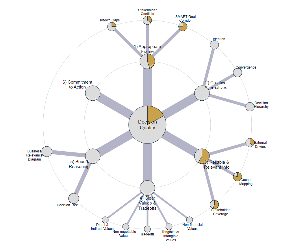
Framing: 2.25/5 (unchanged from Article 1 — see the sub-dimension breakdown there: goal corridor, stakeholder conflicts, known gaps)
Information: 2.92/5 (58%) — broken down across three sub-dimensions: Stakeholder Coverage (roughly 55%): the four groups with formal influence are mapped, along with the one glaring absence, but the internal diversity within each group — splits and minority positions within groups that look unified from the outside — isn’t covered here; that’s its own later article. Causal Mapping (roughly 80%): fifteen drivers and twenty-seven connections are documented, with all four self-reinforcing patterns actually traced through — not just named — and assumptions explicitly flagged as evidence-backed or still-to-be-verified rather than blended together. External Drivers (roughly 40%): named but only briefly explored — climate, competing destinations, EU regulation deserve more than the one paragraph they got here.
Alternatives / Reasoning / Values & Trade-offs / Commitment: n/a — not yet reached.